Presenting data insights effectively can make a huge impact on your audience and drive your business’s success. Despite the fact that many big companies invest millions of dollars, time, and effort into research and development, extremely crucial presentations often fall short. This article will show you how to harness the power of data insights and intrigue your audience with a winning presentation style. Get ready to level up your data presentation game!
1. Invest More Time on Your Presentations
One way that you can ensure your presentations are impactful and the data is effectively presented is by spending more time working on them. This extra effort can provide numerous benefits for your business including helping you achieve your business goals and establishing your company as a leader in your industry.
By investing more time on your presentations, you will have the opportunity to dive deeper into your data insights and uncover valuable information that can inform and influence important decisions. You can present your data in a more compelling way by analyzing and interpreting it, highlighting the most important points, and crafting a story that resonates with your audience.
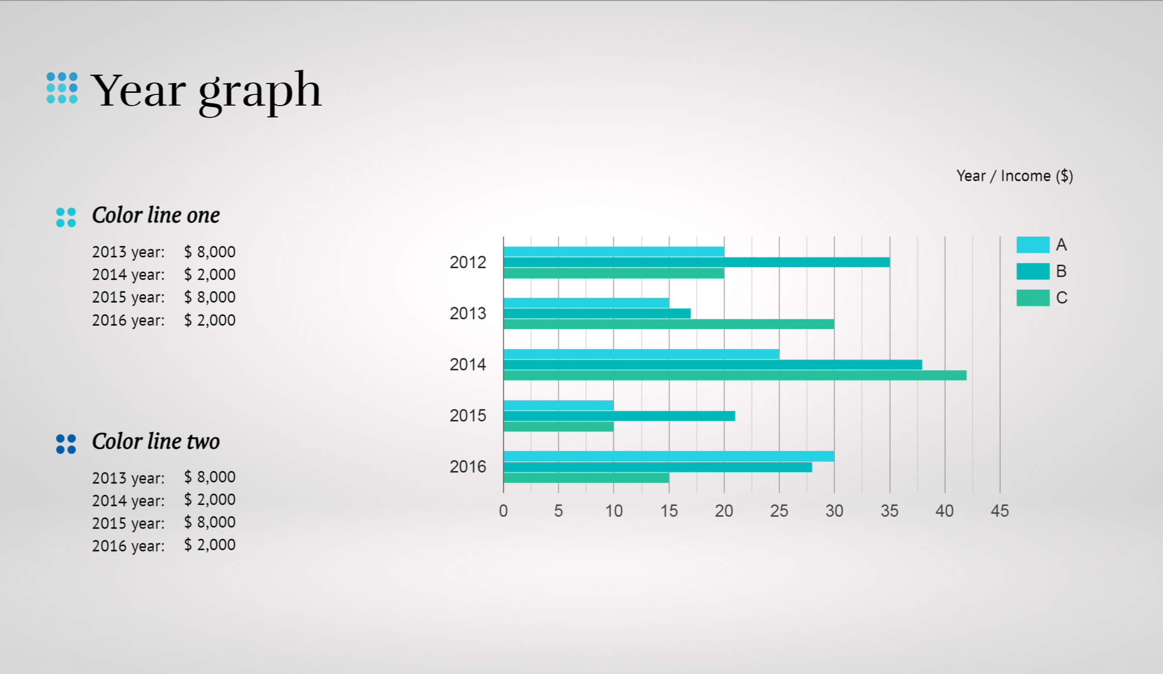
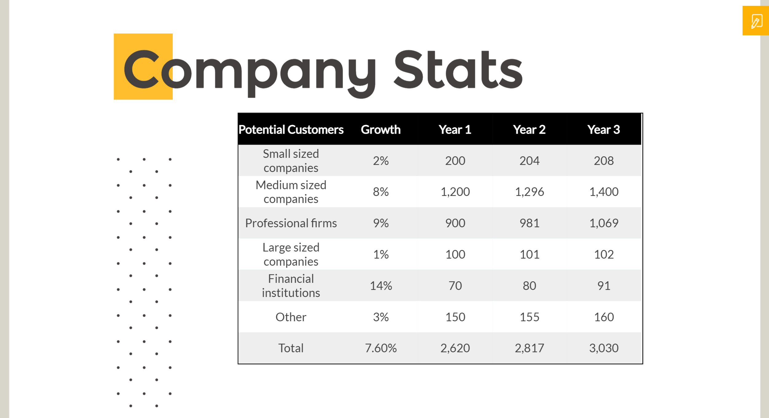
When you dedicate more time to your presentations, you can effectively utilize various types of data visualization. Whether it be tables, charts, and graphs or other creative visual aids, a well-designed presentation can make complex data easier to understand and remember. Using a variety of visual aids can help your audience grasp the information better and retain it longer, making your presentation more impactful.
Spending additional time on your presentations can improve the overall quality and professionalism of your work. You’ll be able to refine your data insights, edit your slides, and rehearse your delivery to ensure you are presenting a polished, confident, and convincing presentation. This level of preparation and attention to detail will set you apart from your competitors.
2. Reflect Your Brand’s Values Through Your Data Presentation
Your brand’s values are a reflection of who you are and what you stand for as a business. When it comes to creating company presentations, it’s important to keep these values in mind and make sure they are supported in your data presentation. That’s where emaze comes in – our Brand Manager makes it easy for you to infuse your brand values into your presentations. Simply set your company colors, fonts, and logo and let us help you convey your message while showcasing your brand in the best possible light. Choose from a variety of data visualizations, including tables, charts, and graphs, to bring your presentation to life. So why wait? Click here to start creating a presentation that truly reflects your brand values with emaze today!
Don’t let your brand be tarnished by a sloppy or amateur presentation. People are naturally drawn to data presentation that is familiar to them and easy to understand, so make sure your tables charts and graphs are clean and visually appealing. Need inspiration? Check out this fantastic display of data visualization from emaze below.

Remember, the way you present your data insights is just as important as the insights themselves. Make sure your data presentation is polished and professional, and your brand’s values will shine through loud and clear.
3. Eliminate Clutter and Focus on Key Metrics
Maximizing the impact of your business presentation starts with cutting the clutter and focusing on what truly matters. While it may be tempting to deck out your slides with as much data and information as possible, this approach often leads to confusion and overwhelmed audiences. To avoid this pitfall, it’s important to take a step back and evaluate the essentials.
But how do you know what’s truly critical? This is where an objective third party can be incredibly helpful. Find a friend who’s unfamiliar with your data and ask them to review your presentation before you deliver it to your target audience. This person can provide you with valuable feedback on what’s confusing, unnecessary, and what truly drives your main point.
As a brand executive, it’s easy to get caught up in the excitement of all the research and data you’ve gathered. However, it’s essential to remember that the goal is to clearly communicate your findings and make a lasting impression on your audience. To achieve this, focus on one primary aspect per slide and stick to just one metric that directly pertains to your audience. This approach allows you to keep your presentation simple, clear, and engaging, resulting in the maximum impact for your brand.
Use this visually stunning presentation template instead of creating your own!
4. Maximize the Impact of Your Data: Choosing the Right Tables, Charts, and Graphs
With so many available options, it can be overwhelming to choose the best way to present your data. That’s why emaze is the perfect tool to help you make the right choice! Emaze has a large selection of tables, charts, and graphs that allow you to showcase your data in the clearest way possible. With such a vast library at your fingertips, you’ll never feel limited or constrained when presenting your data.
Each type of table, chart, and graph has its own advantages and disadvantages, so it’s important to know which one is best suited to your data and message. For instance, scatter plots are an excellent choice for showing distributions, line charts are perfect for presenting relationships, and pie charts are ideal for displaying compositions.
When selecting your tables, charts, and graphs, there are two critical factors to keep in mind: the data itself and the message you want to convey. Are you trying to show a relationship, distribution, comparison, or composition? Secondly, consider your audience and what will resonate with them the most. Use a type of data visualization that will highlight your variables while reducing the time it takes your audience to understand your data. By being mindful of these key points, you can create a presentation with emaze that not only captivates your audience but also effectively communicates your data insights in a memorable way!

Designing a captivating presentation to showcase your data is easier than you think! In fact, it can be as simple as revising your presentations by adjusting the axes on your existing graphs, or decluttering extra information to highlight your key points more effectively.
When creating presentations, focus on the message you want to convey and simplify your ideas into clear, concise points. Having a solid understanding of the message you want to communicate will make it easier to choose the right type of data visualization to present your information.
Don’t let a poor display of data ruin all the time and effort you put into collecting and analyzing it. It may seem easy to throw together a scatter chart or line graph and present it along with a verbal explanation, but keep in mind that all that your audience is going to remember at the end of the day is the data visualization.
Introducing emaze: a Revolutionary Way to Present Your Data
Emaze gives you access to all the innovative presentation design tools you could possibly need (and more!) so that you can impress your audience with stunning visuals, sleek designs, and easy-to-use features to create tables, charts, and graphs that bring your data to life. With emaze, uploading your data straight from Excel or Google Sheets into the editor is a breeze, and the option to customize your type of data visualization gives you the creative control you need to make your presentation truly unique. Whether you’re presenting to a room of executives or a classroom of students, emaze is the perfect solution to help you make a lasting impression.
Completely transform your presentations with emaze—click here to start now!


