This blog post was written by Eugene Cheng of http://www.slidesthatsell.co/
So you just spent a couple of hours creating your beautiful presentation on Emaze.
You delivered it flawlessly at your event and showed it to all your friends who high-fived you when they saw how great it was.
Now what? Wouldn’t you like to take those Emaze presentations further?
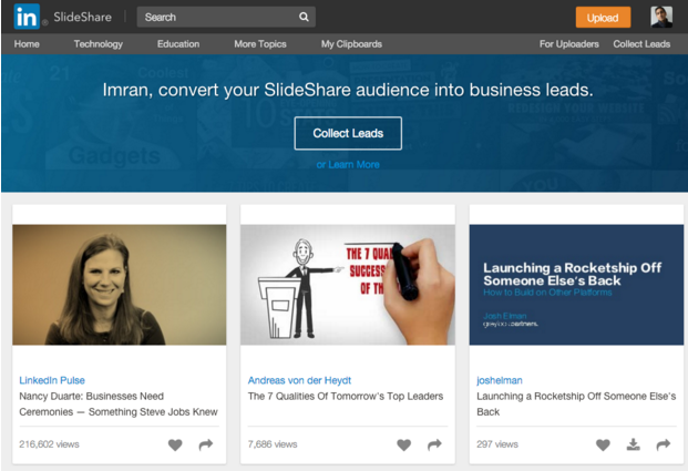
What if I told you that you could potentially reach out to more than 70 million monthly visitors with the presentation that you forged through so much hard work and effort?
There’s no doubt that Emaze is one of the top platforms for building epic presentations fast.
When you couple the effectiveness of Emaze with the viral potential of SlideShare, you can expect to take those beautiful presentations far and get in front of a large executive audience.
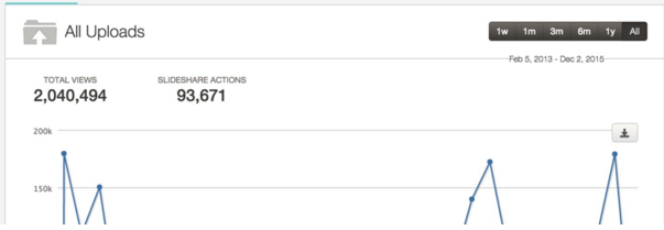
Let me share some insights I’ve gained from garnering more than 2,000,000 views and 400+ subscribers a month using SlideShare myself so you can start getting the recognition you deserve from your work.
Here’s some proof on the power of SlideShare – my 2M views on my 16 presentations over the last few years:
Use Emaze to Create An Epic SlideShare
Emaze’s platform boasts a variety of exceptional features that make it great for creating SlideShares. Not only is Emaze poised to enable you to build great-looking presentations fast, you’ll also be able to optimize your SlideShare for virality.
Export as PDF*
Although Emaze is better known for hosting your presentations on the cloud, where they’ll be safe and accessible from anywhere in the world, you’ll also have the option to export your presentation as a PDF which is compatible to be uploaded to SlideShare.
*Please note: exporting to PDF is a premium feature
Embed Live Links
SlideShare is well known to be a medium that enables your presentations to go viral.
A large part of how this happens boils back down to the links that it lets you embed into those presentations. Sometimes, it can be cumbersome trying to embed links into your PDF files if you lack a professional editing software, but well worth the effort.
Optimize for SEO
For the Emaze presentations that you upload to SlideShare, be sure to optimize them for search. SlideShare sees more than 70% of its traffic from search. This means, with the right optimization, you’ll be able to attract targeted traffic that are interested in your content.
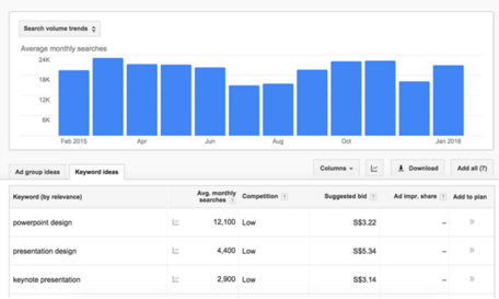
There are plenty of simple ways to ensure that your SlideShare reaches the largest possible audience of interested people. The most effective one is to associate your deck with the correct search keywords.
Although it’s tempting to choose extremely popular keywords that you’re sure will be frequently searched, this strategy is unlikely to work because so many other content creators have had the same idea.
Rather than burying your SlideShare beneath pages of other results with generic keywords, try to choose more specific longtail keywords. Although a smaller crowd is likely to search for these keywords, your results could show up on the very first page when they do!
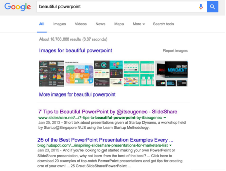
For example, the keyword ‘powerpoint’ is absolutely flooded with search results. However, the more specific term ‘beautiful powerpoint’ has significantly fewer.
When I used this keyword for my SlideShare presentation, I wound up on the very first page of Google search results and directed a ton of traffic to my deck–as of now, it has over 900,000 views!
Here’s the presentation that got 900,000 views:
If I had tried to compete with every result tied to the term ‘powerpoint,’ there’s no way my work would have been seen by so many people.
Additionally, make sure you’re carefully selecting the words in your title, description, and transcript, since this text is also analyzed by search engines.
Think of your description as an advertisement for your SlideShare, and apply the same principles that you would if you were delivering a sales pitch.
Keep it short, intriguing, and full of attention-grabbing keywords, and you’re sure to direct a big crowd to your content.
Optimize for SlideShare
With every tool, even powerful ones like Emaze, you’ll need to adapt the way you use it for different uses. For SlideShare as a medium, you’ll want to create content that can stand on its own.
Stand on its own
Without a presenter to narrate the slides, it can be difficult for audiences to comprehend the story you’re trying to tell if they can’t grasp the concept of what you’re saying simply with images.
In the words of Albert Einstein, “If you can’t explain it to a six-year-old, you don’t understand it yourself.”
Though it may initially seem difficult to communicate a complex concept in a simplified way, it’s always possible! A little creativity help you get your ideas across in easily understandable terms.
For instance, in the slide above, notice that both the text and the image communicate the same message: combining the three listed elements will increase the quality of your photos. Even if you eliminate the sentence at the top, you can understand what the symbols are intended to communicate.
There are a few additional techniques you can apply to ensure that your SlideShare is easily understandable without you there to narrate your thoughts.
Make sure you presentation includes transition slides that inform your viewer when you’re moving from one topic to the next.
It’s not difficult to design clean ‘bumper slides’ that clearly indicate transitions, and the benefits are huge–without them, your viewer could feel that your presentation is jumping unpredictably from one topic to the next and become confused, prompting them to lose interest in your SlideShare.
Use lots of images
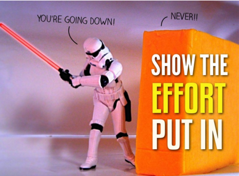
When it comes to grabbing an audience, images are key. Visuals are processed 60,000 times faster than text, and they’re also much more effective at inspiring an emotional response or catching a viewer’s eye.
In the image above – what did you notice first – the words or the block of cheese and the stormtrooper. Chances are you noticed the picture right!
Moreover, you should limit the amount of text on each slide to one or two lines (like above) and let your pictures tell the story. You can find great royalty-free images on sites like Unsplash.com, both of which have an enormous amount of content available free of charge.
If you really want to impress (or you need highly specialized graphics that you can’t find through a general search), there’s also the option of paying a designer to produce the content you need. This process is often surprisingly low-cost, and the results can be incredible.
Investing a small amount of money ($26 in this case) into stellar design elements for this presentation below attracted over 400,000 views and was named the top presentation of the year in 2015.
Once you’ve found images that work well for your presentation, make sure you’re using them in the right way! There’s no point in wasting high-quality images on poorly-designed slides.
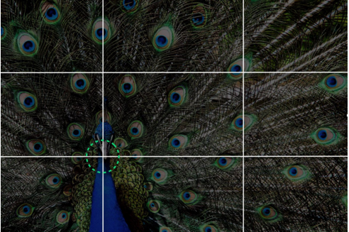
For instance, always remember the rule of thirds.
This technique, used by professional photographers everywhere, results in the most visually-engaging layouts. When positioning an image on a slide, take note of the focal point.
For instance, in the image below, the focal point is the peacock’s head. When you’re positioning this image, your first instinct might be to put the focal point in the centre of the page. However, the human brain responds much better to asymmetry.
For this reason, you should always aim to to position the focal point about a third of the space from the edge–in one of the four places with the gridlines intersect in the image below.
This layout is pleasing to the eye and also leaves a large open space for you to insert your text:
A combination of striking images and a brief textual overlay is the recipe for a compelling SlideShare presentation!
Make it Skimmable
If you want your presentations to be popular, it’s important to understand how people will be consuming them. Don’t expect your audience to thoroughly pore over every slide in your deck!
People typically take in online content by skimming through, slowing down only when they see something of particular interest.
In order to accommodate this behaviour, keep your slides brief and focused on visuals over text. The number of words per slide should rarely exceed ten, and each slide should smoothly flow into the next to keep people skimming.
Don’t think in terms of how much value a slide adds on its own; think of how it contributes to the value of the overall presentation. A focus on the whole will produce a well-rounded presentation where many brief slides work together to create an outstanding final result.
Deliver instant gratification
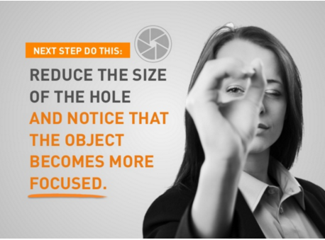
Typically, your audience will be viewing your SlideShare in search of instant gratification.
Make sure that you provide practical tips and hacks that can be instantly put into action.
In the example above, the viewer can try a quick experiment which allows them to see one of the lessons from the presentation demonstrated before their eyes.
Alternatively, if your presentation is about how to remain organized, a viewer wants to close the deck and feel that they can immediately start applying the organizational strategies that you recommend.
It feels great to learn something new, and, if the viewer finds your advice instantly helpful, they’re much more likely to share your deck!
Distribute your presentation
We mustn’t rely on SlideShare alone to do all the work for us, though. It’s not yet a silver-bullet solution. Using it in tandem with other social platforms and even Emaze’s own sharing functions will enable you to build a more viral presentation.
One great way to distribute your presentation is by taking advantage of Click-to-Tweet. Using this free service, you can select short, attention-grabbing quotes from your presentation and allow your audience to share them on Twitter with a single click.
The resulting tweets will include a link back to the presentation they were pulled from.
This service is a great way to sustain the popularity of your SlideShare deck. If your quotes are strong enough for viewers to share with their friends, it’s likely that those friends will be inspired to share them with their friends, and so on.
As long as people continue to post about your presentation on social media, there should always be a steady stream of curious people investigating where these stellar quotes came from!
Another great distribution technique is to direct traffic from owned media. If you’re active on the internet, you’ve likely created much more content than just a SlideShare presentation; perhaps you have a blog, a website, a repertoire of other SlideShare decks, or all three.
Maybe your content has been successful enough that you’ve even managed to compile an email list of targeted audience members. Now is the time to take advantage of all that work you’ve done in the past!
As soon as you create a new deck, share it on your social pages, your website, and your blog, and fire off an email to the people on your lists.
SlideShare has a huge amount of viral potential, and it’s time for you to take advantage of it. Set up a SlideShare deck and draw a huge online crowd to your next presentation.
The Largest SlideShare Virtual Summit Ever
If you want to really learn everything there is about SlideShare and presentation design – we are hosting a free 4-day virtual summit from March 9th through 14th where you’ll learn how to create presentations, better, faster and reach more people.
Eugene Cheng is the cofounder and creative lead of HighSpark (formerly Slide Comet), a strategic presentation consultancy serving Fortune 500 companies like Panasonic, Dentsu, and Nike. A self-confessed presentation lover, he relishes in building compelling visual content for his agency’s channel and his personal channel on SlideShare and is also a Keynote Author (top 1% of SlideShare).


