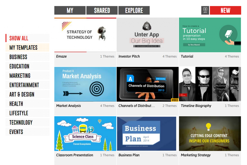
A great presentation is made up of both engaging content and beautiful presentation design. It’s not that difficult! These emazing examples accompanied with tips will show you how it’s done.
1) Prepare your content well and mold it to perfection

- Understand your audience’s interest and their purpose in listening to your presentation
- Come up with one simple core message that will leave an impression on them
- Use numbers in your headings like “3 Types of Presentation Techniques” to help people remember better
- Include stories or give facts and numbers to back up your point and to inspire your audience
2) Develop an appropriate presentation design that helps you to convey your core message

- For example, use a finance theme template for presenting a guide to earning money
- Use shapes or diagrams rather than bullet points
- Don’t be afraid to try something new like 3D transitions to make your audience go ‘wow’
- Include more pictures relevant to your point and use less text
3) Organize your content into slides that flow naturally

- Good presentations are well-paced and well-planned
- Do not distract your audience with overloaded slides
- Include quotes in big fonts to give your audience a break from the same layout and to create more impact
- Animate pictures and objects instead of overusing text
You can have great content. But, developing a good design is always hard and will take you time and effort. If that’s the case, you can always turn to presentation templates.
Be careful not to bore your audience with default PowerPoint templates. Those are sure to make you lose them right from the start!!! Instead, you can check out the free designer templates from emaze if designing is just not your thing.


