We’re back with our annual list of the top design trends to look out for this year. Find out what Hadas, Emaze Head of Design, predicts will be the hottest styles in 2019!
Last year around this time, Hadas told us all about the top design trends to expect in 2018. Now, with many of those design trends regularly appearing in designs everywhere, it’s time to find out what we can expect to see in 2019.
Just to recap, these were the top design trends for 2018 we covered:
-the shift to bold uses of typography, and the rising popularity of serif, geometric and monospaced typefaces
-modular design that centers around block/grid patterns
-90’s era design and modern retro making a reappearance
-dark and dramatic web design as an alternative to all the white and light styles
-small decorative details that make simple designs a bit more interesting
Looking back on 2018, we really have seen these design styles pop up virtually everywhere over the course of the year. Now that those trends are mainstream, let’s dive right in to find out what we can look forward to throughout this year!
1. Bursts of bright and vivid colors
Wait, what now? Yes, you read that right! You might be wondering, “Haven’t design trends been leaning towards light, neutral colors in recent years?” That is correct. But things are starting to change, Hadas explains, and we can all expect to start seeing some super bright, saturated colors appearing in designs, such as in the Emaze template “Vibrant.”
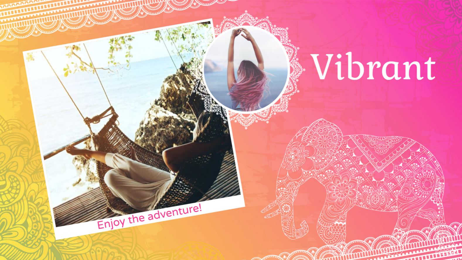
Note that this style is specifically focused on intense hues and light colors, rather than darker bold colors like blacks and dark reds. Though this design style seems like a complete 180 from the style that websites and blogs have been, it’s a trend we’re excited about! This will be an exciting style to observe and see how individuals and brands incorporate more bright colors into their creations.
2. Bold font as the main component of a design
As you are probably aware, the past couple of years have shown that using a strong sans serif typeface is a good move. Whether as the title text in a presentation or on different pages of a website, it is very clear and easy for people to read. What we’re going to start to see however, Hadas explains, is that very text as the main feature of the design itself. So the font itself is going to be the design. An example of this can be found in the Emaze template, “Delish.”
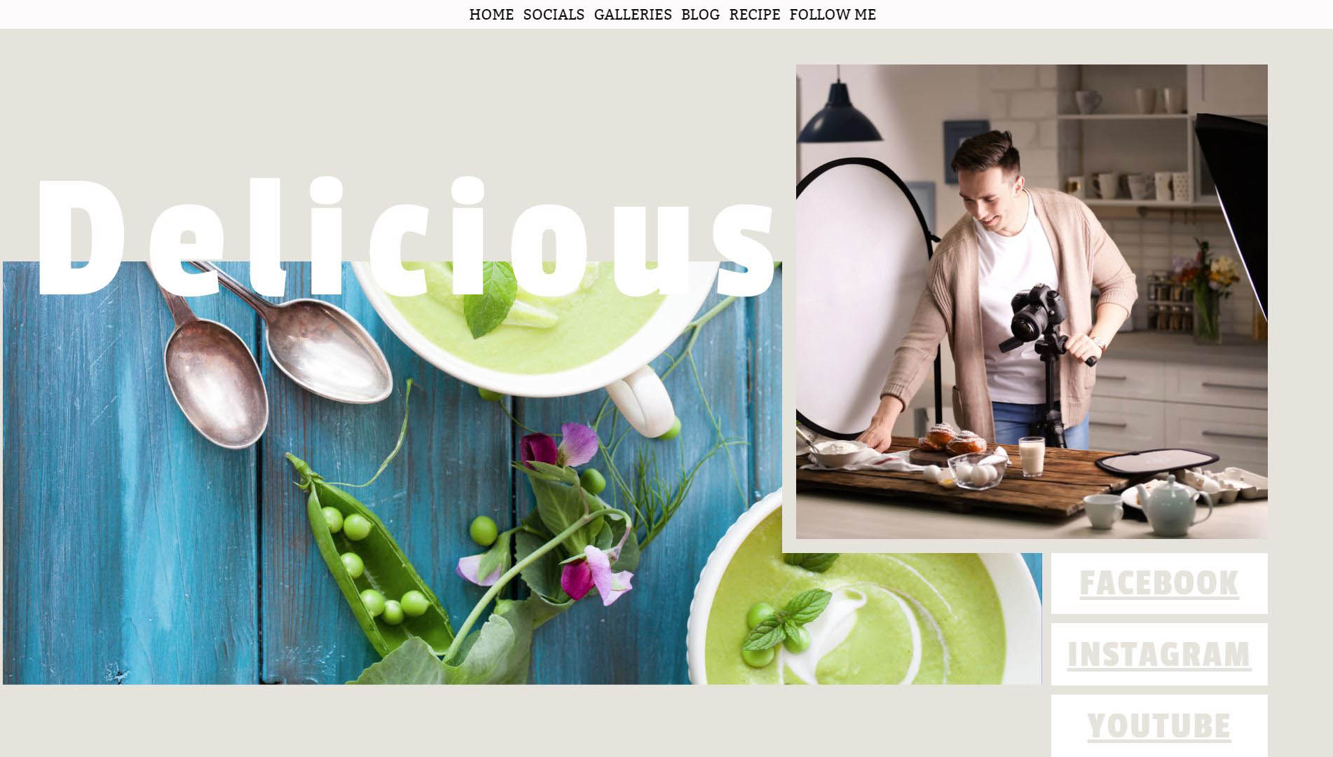
Why is this? Having the bold font as the main feature of the design makes it super easy for users to read, captures their attention when you only have a few seconds to do so, and reads great on mobile devices. As responsive design becomes a higher and higher priority, we see why this will be a no-brainer style for people and brands to try out.
3. Gradients galore and duotones
At Emaze, we have always been a fan of gradients, which anyone can see from our website and branding materials. It simply looks fresh, fun and inviting. Perhaps what is so attractive about gradients is that they are both futuristic, and yet playful. This style started to become quite popular last year and it looks like that trend will only continue to grow in all areas of design. Gradients can be applied in a few different ways, including as the background of a design or the filler of shapes and elements, or overlaid onto photos where the colors of the image are manipulated to show as the colors of the gradient. Take a look at the website template “Gradient” here.
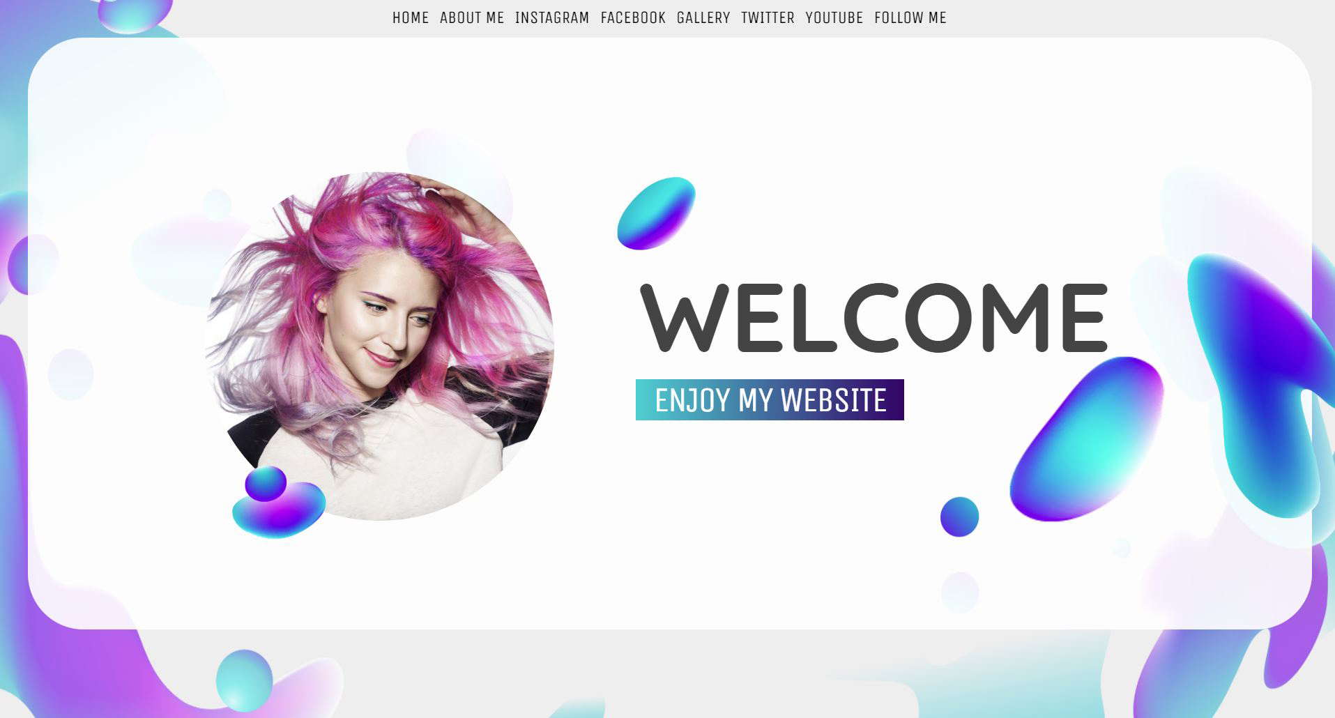
Similarly, duotones are being incorporated into website and blog designs, Hadas explains. Duotones are where the black and white of an image is replaced by two other colors, giving the image a very unique effect. This style definitely looks best when it is applied consistently across the design. Though definitely not as popular as the gradient style, it is still certainly a cool one to try out, and pretty mesmerizing to users.
4. Light? Dark? How about both.
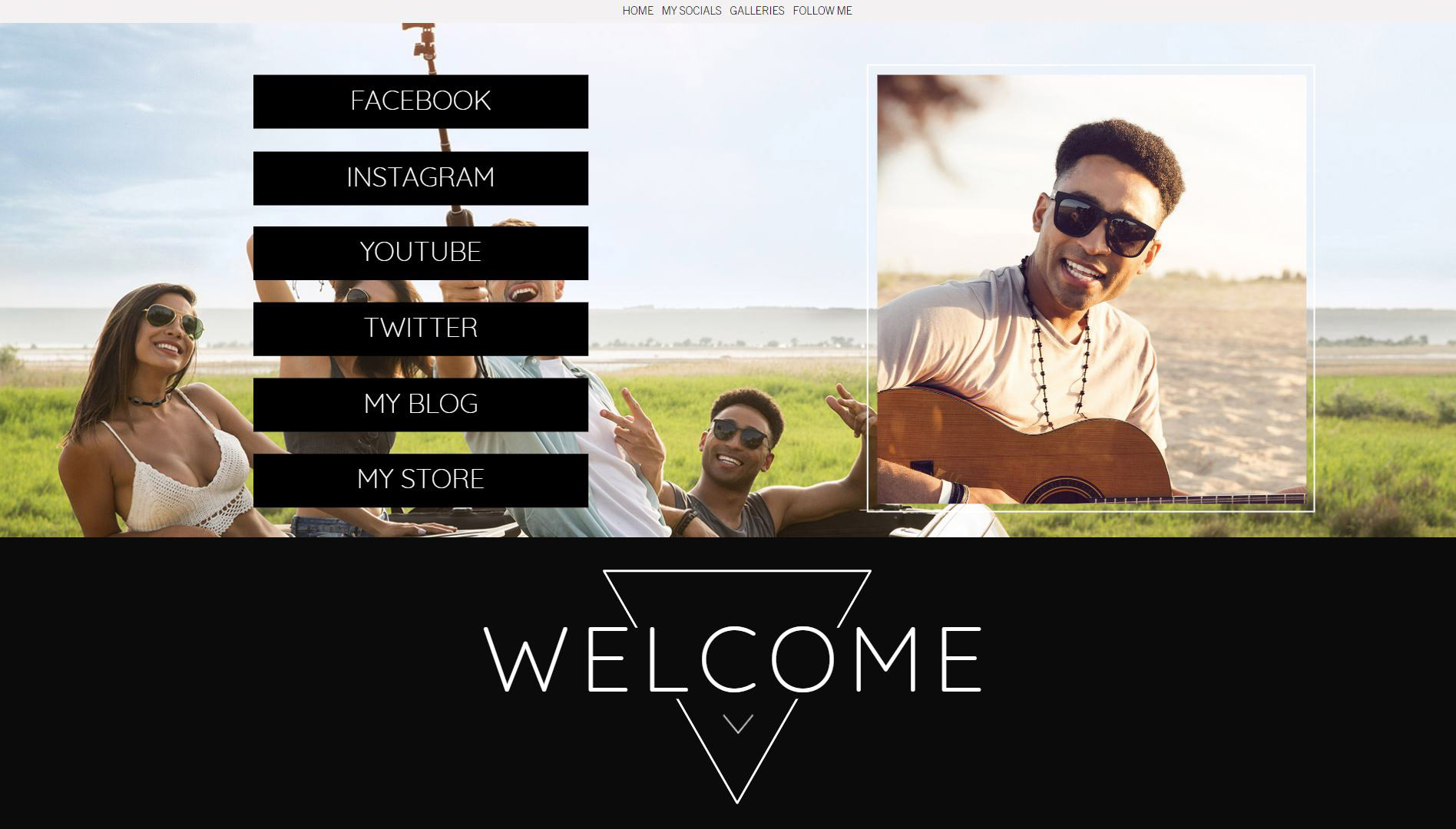
You may have previously thought that designers and brands have to choose a style and stick with it- light or dark. But what we’ve been starting to see in 2018 and will continue to see in the new year is designs built for both. Many online platforms have incorporated a feature that allows users to view the content displayed on either a light or dark background, and designs for print are being printed on both. This seems like a pretty easy way to cater to people’s different aesthetic preferences and personal styles. At Emaze, we’ve been on board this trend for a while, by designing multiple themes for many of our templates, in both light and dark styles, such as the “Limitless” presentation template and the second “Limitless Night” dark theme. Take a peek at the “Pure” website template to see the trend in action.
5. Minimalism can be colorful too!
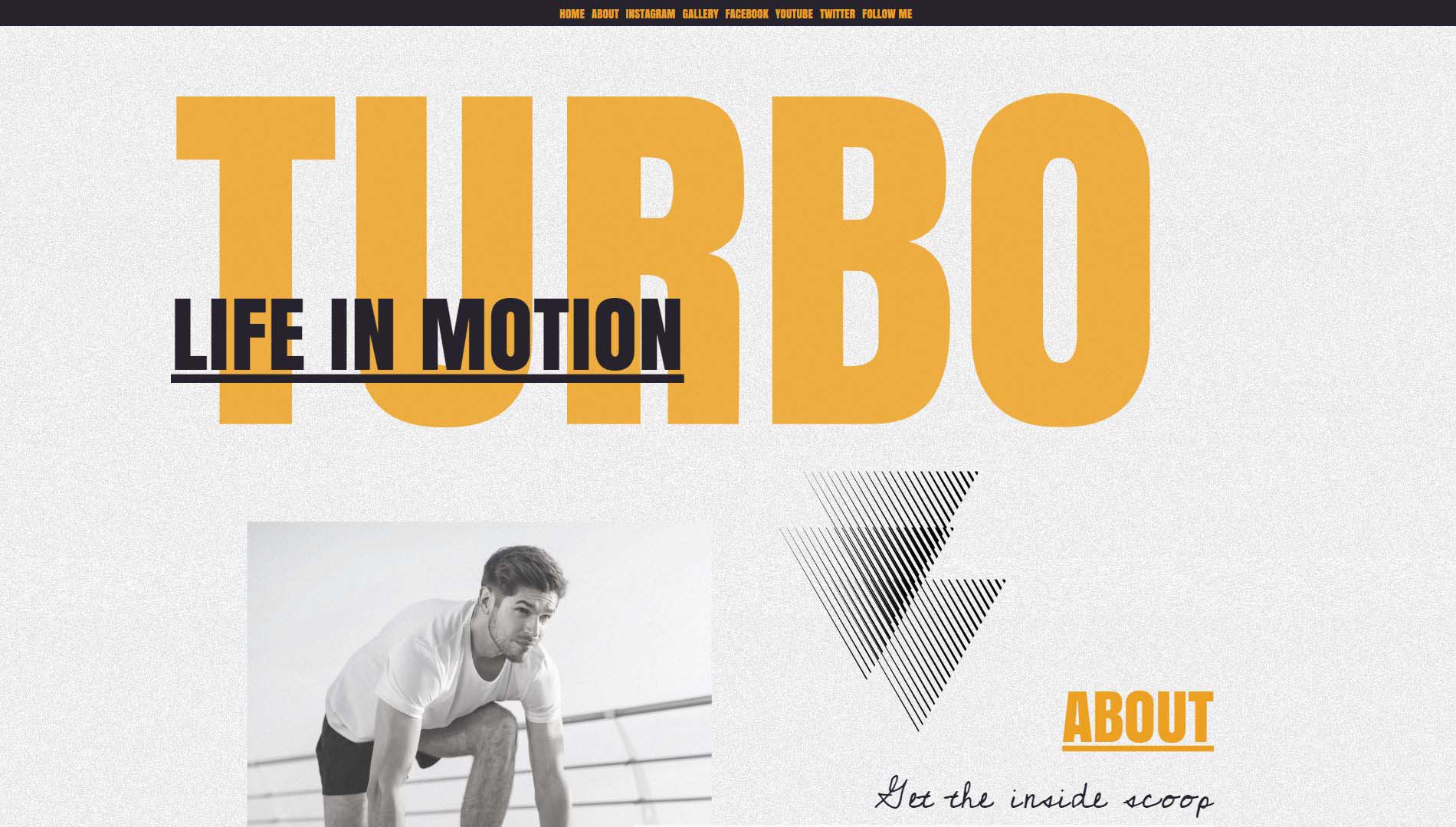
Many people associate minimalist design style exclusively with whites and neutral colors, Hadas explains. But to design with minimalism, this means to try to remove all the clutter and business from a design, but not necessarily all color. In 2019, we are going to see the rise of minimalist design with pops of bright color. This style will still be quite minimalistic just like before, but will ever so slightly incorporate a little color. This is going to make designs a bit more interesting to look at. See this style in action in the website template “Turbo.”
Overall, it looks like 2019 is going to continue to bring many exciting design trends to look forward to! Are there other design trends you think we can expect to see this year? We would love to hear what you think! Email us at gabriela@emaze.com to share your predictions.

